


Post by Tiko on Feb 25, 2016 15:27:27 GMT -5
Whether you're a new forum admin or a seasoned one, getting the dreaded creative block (or in this case, "Color-block") is real as well as real important when you are on a deadline to get your forum published.
In this thread, I want to show you some ways you can train or prompt yourself for becoming inspired to create. One of the reasons for starting this particular forum (aside from the many that I already have) is that I can focus on one thing verses the many themes and topics encompassed on one. In this case its how to color scheme your forum, which from what I have found can be quite daunting when you have so many tools at your disposal.
One of the obvious ways creating themes is important for your forum is to allow your members to get a feel for the forum, aside from the content, that makes them feel comfortable or prompts their call to action in discussions.
Many other creative's sites offer ways to show you HOW to scheme your specific forum or site but not so much how to become inspired by such and that's where I come in.
So below, I'll give you my top 5 tips on how you can jog that mind of yours to see color in a way to make you want to run to your computer and create!
And there it is, my 5 tips of finding inspiration for your forums color scheme. Always keep in mind as I've stated redundantly, make sure you do the research necessary before diving into a color palette that may confuse or turn off your audience. Always experiment and marinate on your color palette before publishing it, sometimes there are little things that can improve the way the scheme flows or meshes on a computer or mobile device screen.
What are some ways you find inspiration for scheming your forum? Share your thoughts in a reply.
In this thread, I want to show you some ways you can train or prompt yourself for becoming inspired to create. One of the reasons for starting this particular forum (aside from the many that I already have) is that I can focus on one thing verses the many themes and topics encompassed on one. In this case its how to color scheme your forum, which from what I have found can be quite daunting when you have so many tools at your disposal.
One of the obvious ways creating themes is important for your forum is to allow your members to get a feel for the forum, aside from the content, that makes them feel comfortable or prompts their call to action in discussions.
Many other creative's sites offer ways to show you HOW to scheme your specific forum or site but not so much how to become inspired by such and that's where I come in.
So below, I'll give you my top 5 tips on how you can jog that mind of yours to see color in a way to make you want to run to your computer and create!

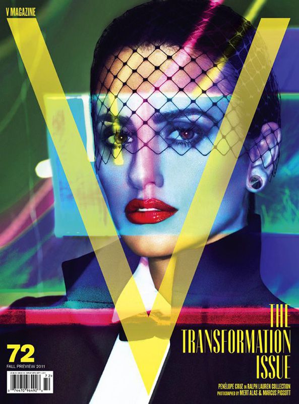
1. Books & Magazines. I collect magazines because I am an avid reader of glossy publications. They give me lots of great inspiration for many topics I am concerned about but also for the greatly schemed palettes inside and especially out. The use of vibrant colors instantly makes me think of the overall layout of my forum and how I might be able to incorporate similar palettes on my forum. Keep in mind the brand or topic your forum is about, many color palettes are not 'one size fit all' when it comes to web design. But just like magazines, some books are written for various reasons, like for instance a professional audience, and may contain very little or very specific color palettes that work to interest or peak the interest of their target audience. Make sure that you look for publications or books that reflect or are of the same topic as your forum to give you the best ideas for a working color palette. (Color Psychology)

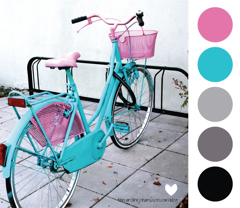
2. Photos. This one is pretty loose and can go either way, but I always say, "If it moves you, go with it!". Photos tend to help give me tons of inspiration when it comes to coloring a forum or even creating a palette to create from. The various types of photos you can look at and feel something from are the ones that might contain that nice hidden palette that could help your forum win with members. As with Books and Magazines, pay attention to the palette that is created or even start out with an idea of what kind of palette you'd like to create to help fine tune what you're looking for in your inspiration. Most of the time, I will collect photos from all over the net, books, magazines, even retail fliers when I see a palette that is appealing to apply to a creation later.

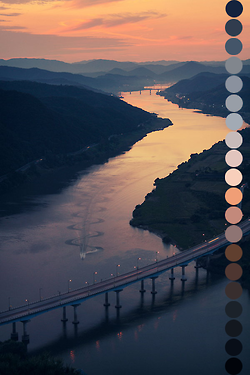
3. Nature and Landscapes. There is so much beauty in the world around us, right? I mean, I can walk outside of my front door on a gloomy and rainy day and see the most beautiful gradient of greys, whites and blues in the sky and it would inspire me to take a photo to capture it or even look up palettes that feature these colors. And again, like the prior two tips mentioned before, absolutely experiment but make sure that the color palette you are going for matches or will spark some form of credibility with guests who can potentially become new members.

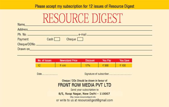
4. Magazine Subscription Cards. Okay, I will admit that this is a bit strange because we've become so trained to simply toss them away since they're seen as a nuisance with their annoying "Act Now" headings, BUT have you ever really looked at one? Yes, really LOOK at one, they're awesome! Not only are they designed to spark the inspiration for a potential color scheme BUT they also come with an interesting layout for your designing aspiration as well!! Double the cool points for Better Homes and Gardens Magazines nifty subscription card!!

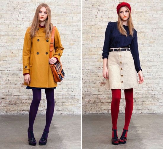
5. Clothing & Shoes. This one is hit or miss because sometimes we'll see an outfit or a palette on clothing that isn't appealing at all the garment or the person BUT when you look at the composition of the colors and how that would translate to a website, its questionable of whether it could actually work. The best advice I could give in this scenario is to experiment and play around with the color palette. Again, not all colors translate well from one medium to the next, the clothing above is a prime example, the outfit on the left (Golden Yellow and Purple with hints of Navy and Red) looks great on the model but when you translate the colors to a scheme it may not work for a lack of a neutral to keep the color-blocking scheme balanced. Whereas, the outfit on the right (Red, Off White and Navy) is perfect as it has the right balance of neutrals with bold colors for you to be able to incorporate without having to go from one extreme to the next (red and blue are very bold colors that work very well together and against one another. The off white helps break them down or in a better word, stops the two dominating colors from being too strong, the off white is a neutralizer, or mediator, of the three colors). (Color Theory for the Web)
And there it is, my 5 tips of finding inspiration for your forums color scheme. Always keep in mind as I've stated redundantly, make sure you do the research necessary before diving into a color palette that may confuse or turn off your audience. Always experiment and marinate on your color palette before publishing it, sometimes there are little things that can improve the way the scheme flows or meshes on a computer or mobile device screen.
What are some ways you find inspiration for scheming your forum? Share your thoughts in a reply.